
An accessible website isn’t just a nice-to-have—it’s essential. In this article, we’ll show you how to test a website’s accessibility.
An accessible website enables people with disabilities to participate equally in digital content. This increases companies’ visibility while also providing them with legal certainty regarding compliance with the Accessibility Act of 2025.
But how can you test a website’s accessibility —in a way that’s efficient, reliable, and practical? In this post, we’ll introduce key testing criteria and proven tools that you can use to check your website’s accessibility step by step.
Do you suspect that your website isn’t accessible? Our checklist for accessible web design provides a good overview of the necessary steps.
Check color contrasts: ensure good readability for everyone
Why This Is Important
Users with visual impairments or color vision deficiencies (e.g., red-green color blindness) need text content with sufficient contrast between the text and the background to be able to understand the content. Even in low or changing light conditions—such as on mobile devices—all users benefit from high contrast.
The WCAG (Web Content Accessibility Guidelines) distinguishes between three levels of conformance: A, AA, and AAA, although the Simple A level can be disregarded due to insufficient contrast. AA should always be the goal; AAA is the gold standard, but it significantly limits flexibility.
The following applies to regular type (12pt and larger):
AA: Contrast ratio of at least 4.5:1
AAA: At least 7:1
The following applies to large font sizes (18pt or larger, or 14pt bold):
AA: 3:1
AAA: 4.5:1
Tool Tip
The WebAIM Contrast Checker allows you to check the contrast ratio between text and background. Enter the text and background colors (e.g., in hex values) and see immediately whether your colors meet the AA or AAA requirements.
Incorporate contrast checks early in the design process—for example, using plugins such as “Contrast” for Figma or as a standard process in front-end development.
Checking Screen Reader Compatibility: Semantically Correct HTML Is a Must
Why This Is Important
Key Evaluation Criteria
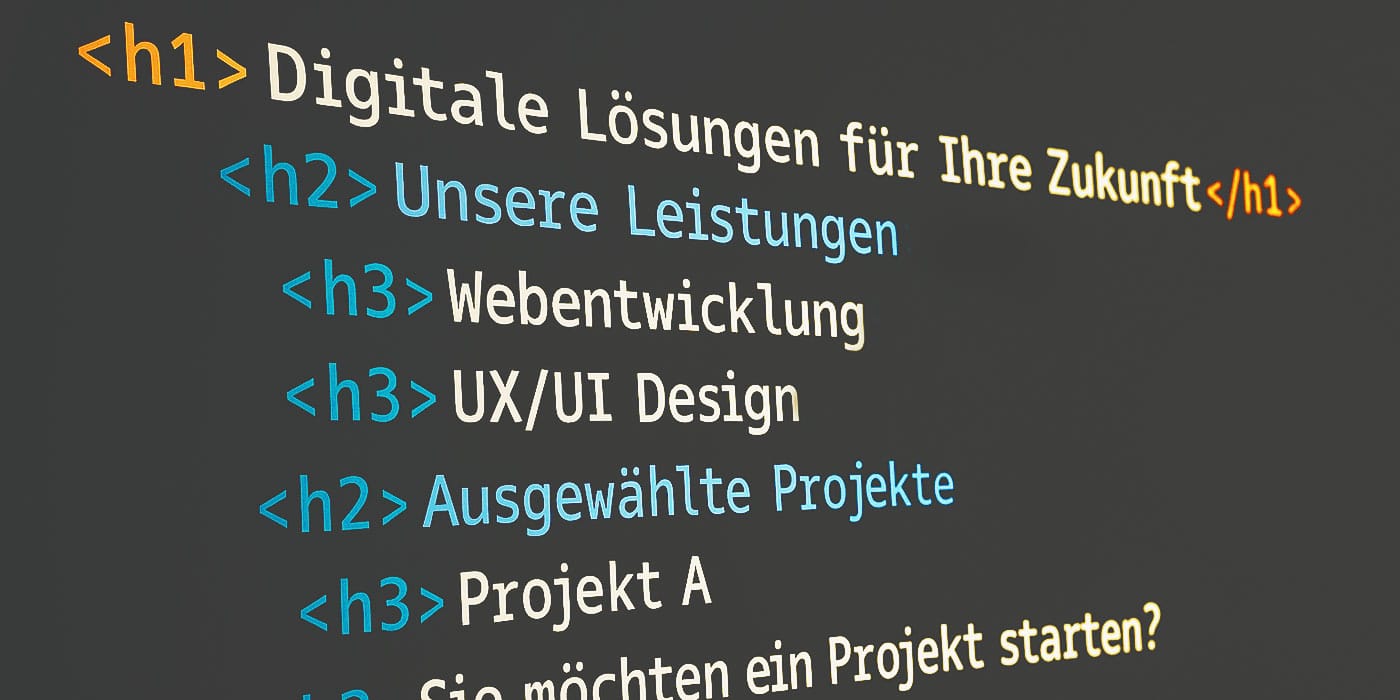
Correct heading structure (e.g., H1 > H2 > H3 without gaps, corresponding to your content structure)
Alternative text (alt attributes) for images – descriptive, but not redundant
ARIA roles (Accessible Rich Internet Applications) should be used only as a supplement and correctly
Label-Tag Assignments for Form Fields
Tool Tip
The WAVE tool (Web Accessibility Evaluation Tool) highlights structural errors directly on the page—highlighted in color, along with explanations and recommendations.
The most practical way to test your website is to actually use a screen reader. Test your website with NVDA (for Windows) or VoiceOver (built into macOS). This will give you a better understanding of how your content feels to users with special needs.
Testing Keyboard Navigation: Can Your Website Be Navigated Without a Mouse?
Why This Is Important
Not all users want to or are able to navigate websites with a mouse. People with motor impairments or screen reader users navigate exclusively using the keyboard. But even power users who, for example, need to fill out forms in a web application can work much faster and more efficiently using the keyboard than with a mouse. A well-designed website should therefore be fully navigable using the Tab key —with visible focus and a logical tab order.
Key Evaluation Criteria
All interactive elements (links, buttons, forms) must be accessible
The focus must be visible and clearly identifiable (e.g., with a colored border)
The order of focus should match the visual order (no page jumps due to differences in position in the code)
Pop-ups, dialog boxes, and drop-down menus must be controllable using the keyboard
Tool Tip
The axe Dev Tools (Chrome extension) automatically highlights focus issues, missing roles, or navigation barriers —with helpful tips for developers.
A simple, manual tab test can also be very revealing—especially when used with interactive elements such as mega menus or sliders. Just open your website in a browser and see how far you can navigate using the Tab key and your keyboard.
Learn
more
We’re more than just experts—our dedicated team of designers, developers, and marketing specialists works hand in hand to take your digital presence to the next level.
Is your digital presence ready for the 2025 Accessibility Act?
Contact us to receive our analysis and consultation.
Automated Rapid Tests: Identifying Early Signs of Barriers
Why This Is Important
Tool Tips
- Lighthouse (Chrome DevTools) and PageSpeed Insights generate an accessibility score based on automated checks—with clear recommendations for optimization.
- Accessibility Insights (by Microsoft) offers interactive, step-by-step checks based on the “FastPass” principle—ideal for developers.
- AccessScan by accessiBe is a simple, quick test for anyone who wants to get an initial assessment of their website’s accessibility. After entering the URL, AccessScan analyzes key aspects such as semantics, keyboard accessibility, and color contrast within seconds—and generates an easy-to-understand report with recommendations.
Please note: Automated tools detect approximately 30–40 % of barriers. Therefore, always supplement them with manual checks and user tests—or have dmcgroup conduct professional audits.

Checking Mobile Accessibility: Staying Responsive and Usable
Why This Is Important
Key Evaluation Criteria
Touch targets must be at least 44 x 44 px (resolution-independent) in size
Responsive layout – no horizontal scrolling
Content remains readable and functional even when zoomed to 200 %
Navigation must also be optimized for mobile devices
Tool Tip
In mobile mode, the Lighthouse tool (Chrome extension) simulates mobile tests and provides feedback on contrast, touch sizes, zoom behavior, and responsiveness.
Note: However, testing tools are never a substitute for testing on actual devices! Test regularly on real smartphones and tablets—not just in desktop simulations. There is a wide variety of different screen sizes and systems that need to be tested.
Check PDFs & Downloads: Documents Must Also Be Accessible
Why This Is Important
PDF content is an integral part of many websites—whether it’s forms, reports, or information sheets. For people who are blind or visually impaired, these files must also be accessible: with correct bookmarks, tag structures, and alternative text.
Key Evaluation Criteria
Tags for Headings, Lists, and Paragraphs
Alternative text for images and graphics
Reading order correctly defined
Document properties filled out (title, language, etc.)
Tool Tip
The free PDF Accessibility Checker tool allows you to check PDFs for compliance with the PDF/UA standard (universal accessibility).
Always create PDFs from sources that support accessible formatting (e.g., a correctly formatted document in Microsoft Word). Making corrections later in Adobe Acrobat Pro can be very time-consuming.
Testing a Website’s Accessibility: Preferably on an Ongoing Basis, Thoroughly, and Holistically
Testing a website’s accessibility is a multi-step process: Automated tools such as WAVE, axe, or Lighthouse help identify initial obstacles. However, true accessibility is achieved through a holistic approach to design, front-end development, and content management.
Our tip: Combine automated tests with manual checks. If needed, bring in experienced accessibility experts from dmcgroup —we’re happy to assist you.
Learn
more
Our offer
Would you like to test your website’s accessibility or make specific improvements to it?
Our design, UX, and front-end teams support you from the initial audit through to accessible implementation—using a technology-neutral, standards-compliant, and practical approach.
Testing a Website’s Accessibility: Questions & Answers
Here you’ll find answers to the most important questions on this topic. If you have any specific questions, we’re of course happy to assist you directly!
Why should I test my website's accessibility?
Accessibility enables everyone—including those with physical or cognitive disabilities—to access digital content. It improves user-friendliness, meets legal requirements (e.g., the Accessibility Act of 2025), and expands your digital reach.
What tools can help with accessibility testing?
There are numerous tools that provide a quick overview, such as
WebAIM Contrast Checker (Color Contrast)
WAVE (HTML Semantics and Screen Reader Compatibility)
axe DevTools (Keyboard Accessibility)
Lighthouse or AccessScan (automated rapid tests)
PAC 2024 (PDF Accessibility)
For an accurate assessment, we recommend an audit by accessibility experts at dmcgroup.
What does "sufficient color contrast" mean according to WCAG?
According to WCAG 2.1, the color contrast between text and background should be at least 4.5:1 (AA) or 7:1 (AAA)—depending on font size and weight.
How can I test whether my website works with a screen reader?
Use tools such as WAVE or screen readers like NVDA (Windows) or VoiceOver (built into macOS). Ensure that you have a correct heading structure, alt text, and semantically meaningful HTML.
How do I test a website's keyboard navigation?
Use the Tab key to navigate through your page. All interactive elements should be accessible, the focus order should be logical, and the focus should be clearly visible. Tools like axe DevTools highlight technical issues.
Are automated tests sufficient?
Automated tests cover about 30–40% of potential barriers. A comprehensive assessment also requires manual testing, screen reader checks, and, ideally, user testing with people with disabilities. For a comprehensive assessment, contact the accessibility experts at dmcgroup.
How do I test accessibility on mobile devices?
Use Lighthouse in mobile mode or test on real devices. Make sure touch targets are large enough, zoom behavior works properly, and mobile navigation is intuitive.
Do the PDFs on my website also need to be accessible?
Yes. PDF documents are also subject to accessibility requirements. For example, they must have correct tag structures, alternative text, and a logical reading order. Tools such as PAC 2024 check PDFs for compliance with the PDF/UA standard.
What is the first step toward implementing accessibility?
Start with a quick test (e.g., using AccessScan, WAVE, or Lighthouse) to identify major obstacles. Then plan targeted optimizations—ideally with the support of experienced accessibility experts from dmcgroup.
Von den aktuellsten Branchen-Trends, über neueste Insights zu KI und UX/UI-Design, bis hin zu spannenden Use Cases.
Melden Sie sich für unseren monatlichen Newsletter an und bleiben Sie immer up to date!
Stay
tuned
More articles
Read more about User Experience, Innovation, Trends, Online Marketing Co.

Digital Product Development: 5 Common Mistakes and How to Avoid Them

Branding in the Age of Agent-Based Commerce

Employer Branding for the City of Düsseldorf